Table of Contents
Google’s Gemini Gets a Stunning Makeover Just in Time for I/O 2026
As Google prepares to unveil its latest innovations at the annual I/O developer conference, Android users are already getting a sneak peek into the future of AI interaction—via a bold new look for the Gemini app. The long-awaited redesign has begun rolling out across Android devices, marking one of the most significant visual and functional transformations since Gemini’s rebrand from Google Bard in 2023. With its sleek blue-and-white gradient interface, reimagined navigation, and more intuitive user experience, Google is signaling a major shift in how users engage with artificial intelligence on mobile.
This overhaul isn’t just cosmetic. It reflects Google’s broader strategy to position Gemini not just as a chatbot, but as a central hub for AI-powered productivity, creativity, and communication. By aligning the Android version with the recently updated iOS app, Google is creating a unified experience across platforms—a move that underscores the growing importance of cross-device consistency in the AI era.
The timing of this redesign is no coincidence. With Google I/O 2026 kicking off tomorrow, the company is using the moment to showcase how deeply AI is woven into its ecosystem. From Android Auto to Google Workspace, Gemini is becoming the connective tissue between services. And now, with a fresh coat of digital paint, it’s also becoming more inviting to everyday users.
A Visual Revolution: From Monochrome to Gradient
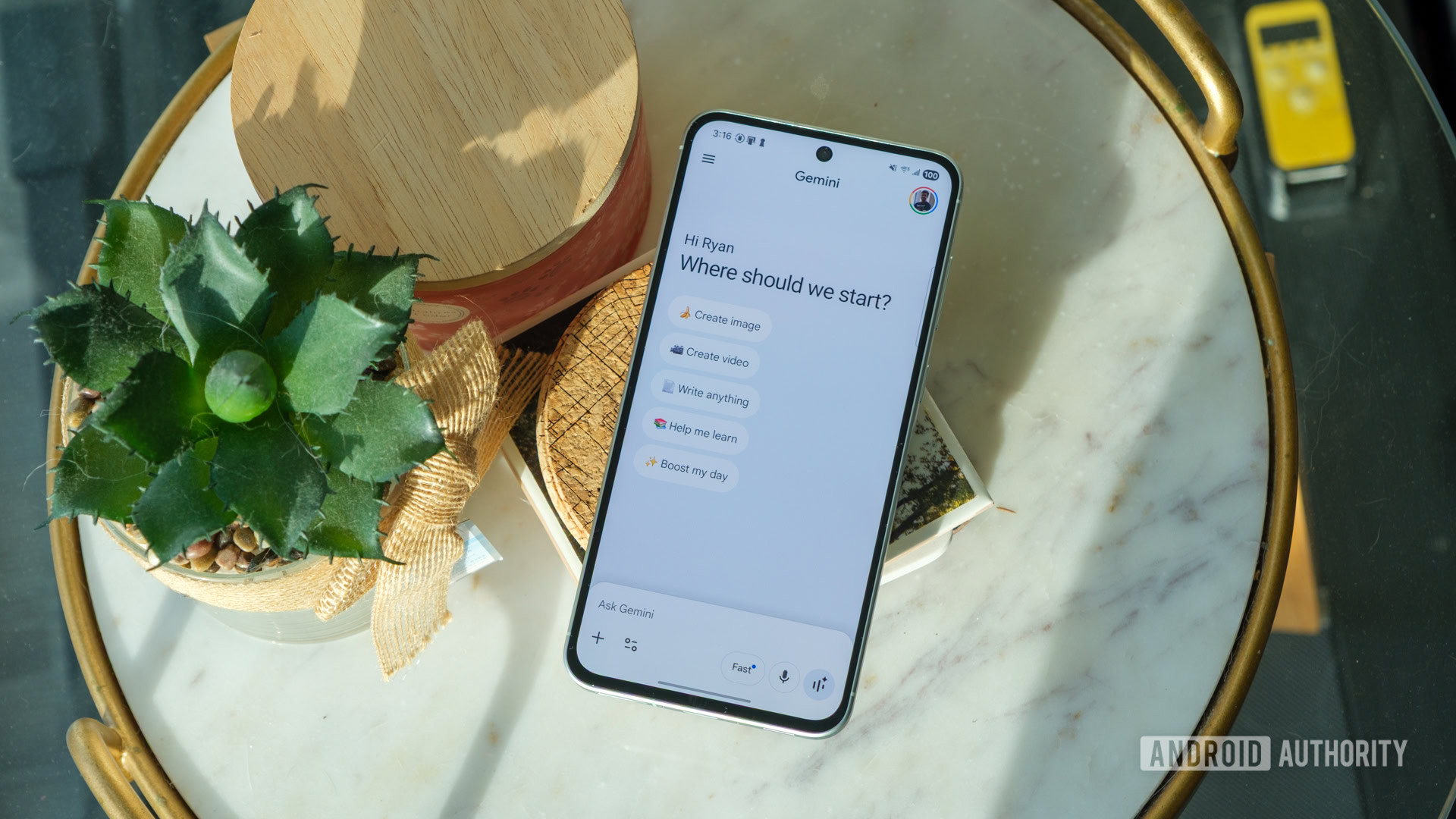
Gone are the days of the stark white-and-gray interface that defined the early days of Google’s AI assistant. The new Gemini app for Android embraces a vibrant blue-and-white gradient that flows seamlessly across the screen, giving the app a modern, almost futuristic feel. This isn’t just about aesthetics—the gradient serves a psychological purpose. Studies in color psychology suggest that blue evokes feelings of trust, calm, and intelligence—perfect for an AI assistant meant to be both reliable and approachable.
The gradient isn’t static either. It subtly shifts depending on the time of day or user activity, creating a dynamic backdrop that feels alive. This kind of ambient design is becoming increasingly common in high-end apps, where visual feedback reinforces user engagement. Think of it like the ambient lighting in a Tesla—subtle, but deeply immersive.
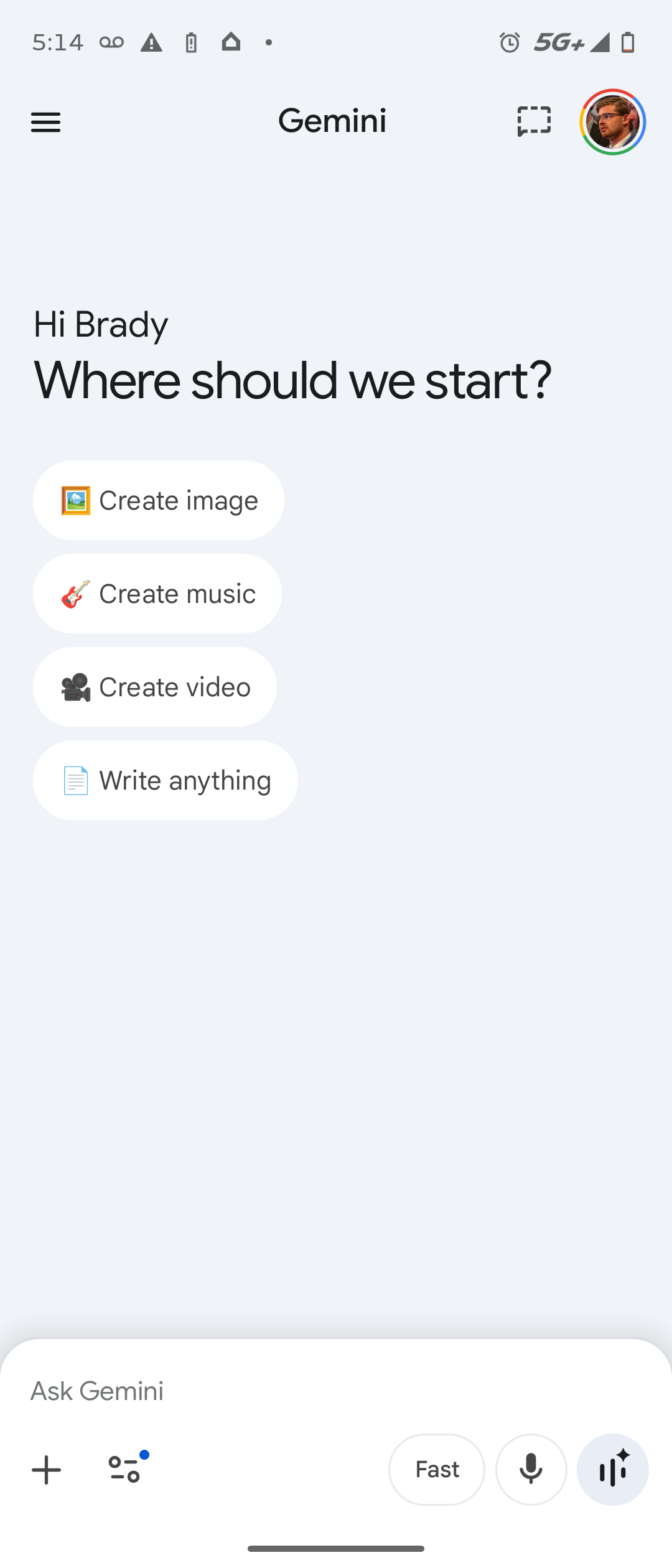
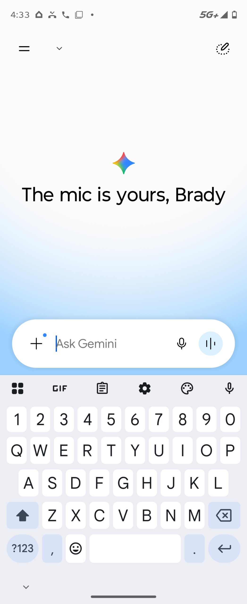
Beyond the colors, the layout has been streamlined. The cluttered homepage of old, filled with suggestion chips and quick-action buttons, has been replaced with a clean, minimalist greeting. Instead of prompting users with “Try asking about…” prompts, the app now greets users with rotating messages like “The mic is yours” or “Ask away.” These aren’t random—they’re designed to encourage voice interaction, a key growth area for Google as smart speakers and voice assistants continue to rise in popularity.
Smarter Navigation: Hiding the Clutter, Highlighting the Essentials
One of the most noticeable changes is the removal of the Google account profile icon from the homepage. Previously, users could tap their profile picture to access settings, history, and account preferences. Now, that icon has been tucked away inside the sidebar menu. While this might seem like a step backward in accessibility, it’s actually a smart move toward decluttering the interface.
Google’s research shows that too many visible options can overwhelm users—a phenomenon known as “choice paralysis.” By moving less-frequently used functions into the sidebar, the app keeps the homepage focused on core interactions: typing or speaking a query. The sidebar, accessible via a hamburger menu, now houses profile settings, chat history, preferences, and even shortcuts to Gemini extensions like Google Calendar or YouTube Music.
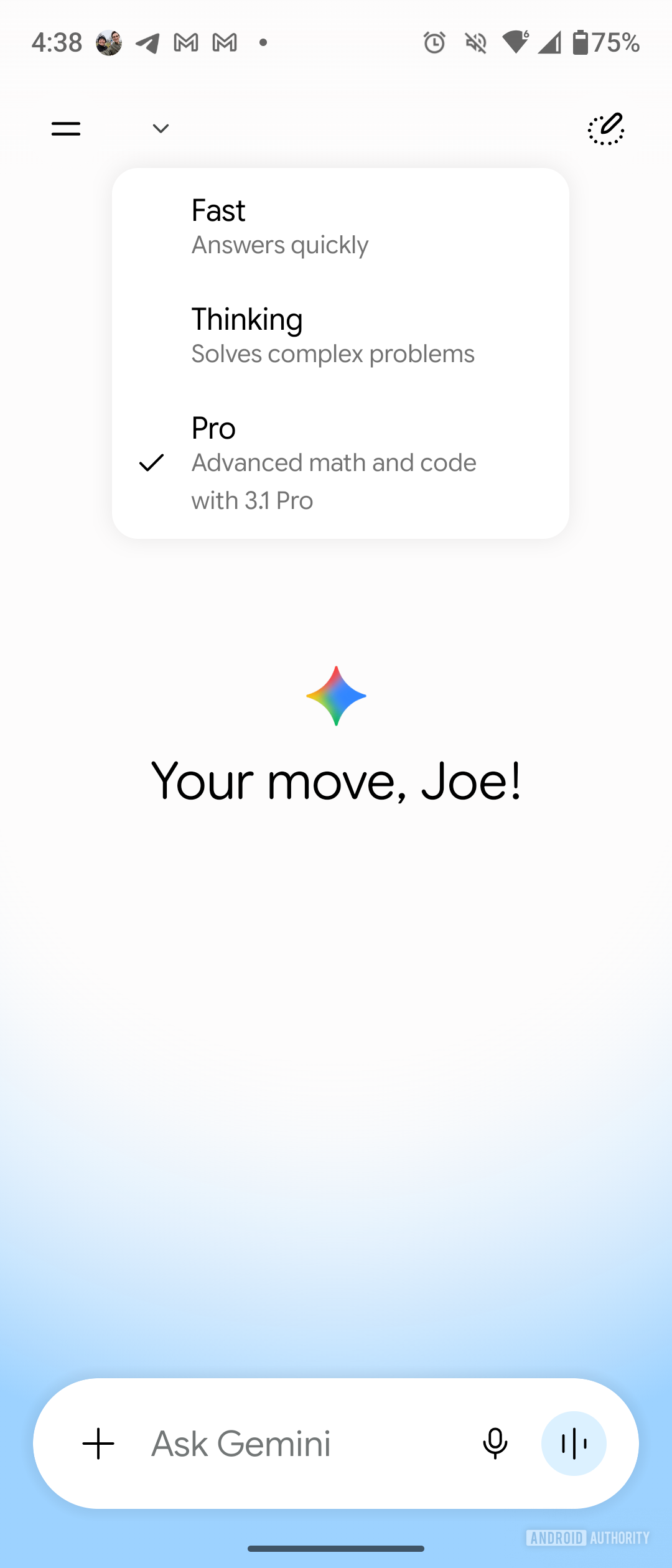
Another key navigation update is the new temporary chat icon. Previously represented by a dotted-line chat bubble, it now features a dotted line with a pen—symbolizing ephemeral, note-like conversations. Temporary chats, which don’t save to your history, are ideal for quick questions or brainstorming sessions. The new icon makes this feature more intuitive, aligning with how users think about disposable interactions.
Cross-Platform Consistency: A Unified Gemini Experience
One of the biggest wins in this redesign is the alignment between Android and iOS versions of the Gemini app. Earlier this month, iPhone users began receiving the updated interface, and now Android users are catching up. This synchronization is crucial in an era where users switch between devices multiple times a day. Whether you’re drafting an email on your iPhone or checking your schedule on an Android tablet, the experience should feel seamless.
Google has been pushing for this kind of consistency across its ecosystem. Just last year, it unified the design language of Google Photos, Gmail, and Google Drive under the “Material You” design system. Now, Gemini is the latest app to adopt this cohesive visual language, complete with adaptive theming that matches your phone’s wallpaper.
This cross-platform harmony also benefits developers. With a consistent API and UI framework, third-party apps can integrate Gemini more easily, enabling features like AI-powered customer support or smart replies in messaging apps. Google is laying the groundwork for a future where Gemini isn’t just an app—it’s a service embedded in everything you do.
The Rise of Voice: “The Mic Is Yours”
The new rotating greetings—“The mic is yours,” “Ask away,” “What’s on your mind?”—aren’t just catchy phrases. They’re part of a broader push to normalize voice interaction with AI. Google has been investing heavily in voice recognition and natural language processing, and the results are paying off. Gemini now supports real-time voice conversations with near-human latency, thanks to improvements in Google’s on-device AI processing.
Voice is becoming the preferred input method for many users, especially in hands-free scenarios like driving, cooking, or walking. According to Google’s internal data, voice queries in Gemini have increased by 140% over the past year. The new interface encourages this trend by making the microphone button more prominent and the greeting messages more inviting.
Moreover, the redesign includes subtle audio cues—like a soft chime when the mic activates—that provide feedback without being intrusive. These micro-interactions are hallmarks of thoughtful design, making the experience feel more human and less robotic.
What This Means for the Future of AI Assistants
Google’s Gemini redesign isn’t just about making an app look nicer—it’s a statement about the future of human-AI interaction. As AI becomes more capable, the interface must evolve to match. Users no longer want a command-line experience; they want a conversational partner that feels intuitive, responsive, and even empathetic.
The minimalist homepage, dynamic greetings, and streamlined navigation all point to a larger trend: AI assistants are becoming more ambient, more integrated, and less intrusive. They’re not just tools—they’re companions. And like any good companion, they need to be easy to talk to, visually pleasing, and always ready to help.
Over 500 million people use Google’s AI assistants monthly, with Gemini being the fastest-growing segment.
The blue-and-white gradient was tested with over 10,000 users across 12 countries to ensure cultural and emotional resonance.
Temporary chats now support up to 10,000 characters, up from 2,000 in the previous version.
The sidebar menu loads 40% faster due to lazy-loading of non-essential components.
As Google I/O 2026 unfolds, we can expect even more announcements about Gemini’s capabilities—perhaps deeper integration with Android Auto, smarter contextual awareness, or even real-time translation in video calls. But for now, Android users can enjoy a cleaner, more inviting way to interact with one of the world’s most advanced AI systems.
The message is clear: the future of AI isn’t just smart—it’s beautiful.
This article was curated from Android users are finally starting to see Google’s major Gemini app design overhaul via Android Authority