Table of Contents
- The Return of the Taskbar: How One Developer Brought Back the Classic Desktop Experience to macOS
- A Tale of Two Desktops: Why the Dock Falls Short for Power Users
- How boringBar Restores Context and Control
- Beyond the Taskbar: Pinning, Previews, and Performance
- A Love Letter to GNOME 2 and the Spirit of Open Desktop Design
- Why This Matters in 2024 and Beyond
The Return of the Taskbar: How One Developer Brought Back the Classic Desktop Experience to macOS
For decades, the desktop metaphor ruled our digital lives. From the early days of Windows 95 to the golden era of GNOME 2 and KDE 3, the taskbar was more than just a row of icons—it was the command center of productivity. It showed you exactly what was open, where it lived, and how to get there. But then came the Dock. Sleek, minimal, and visually elegant, Apple’s Dock replaced the taskbar on macOS, promising simplicity. For many, it worked. For others, especially those migrating from Linux or Windows, it felt like a step backward—a beautiful cage that obscured context and workflow.
Enter boringBar, a quiet revolution in macOS window management. Created by a developer who traded his Fedora-powered laptop for a MacBook Air, this open-source tool reimagines the macOS desktop experience by resurrecting the familiar, functional taskbar. It’s not flashy. It’s not full of animations or AI-powered widgets. But it’s effective—and that’s exactly why it’s resonating with a growing community of power users, remote workers, and nostalgic desktop enthusiasts.
A Tale of Two Desktops: Why the Dock Falls Short for Power Users
Apple’s Dock is undeniably beautiful. It’s smooth, animated, and integrates seamlessly with macOS’s design language. But beauty can come at a cost. The Dock aggregates all open applications across all virtual desktops—called “Spaces” in macOS—making it difficult to distinguish which windows belong to your current workspace. If you’re working on a coding project in one Space and browsing research in another, the Dock shows both, creating visual clutter and cognitive load.

This becomes especially problematic for users who rely on multiple Spaces to organize their workflow. On GNOME or Windows, the taskbar typically shows only the applications in the current workspace. This contextual awareness helps users maintain focus and reduces the mental overhead of window management. The Dock, by contrast, treats all Spaces as one giant desktop, undermining the very purpose of virtual desktops.
GNOME 2, released in 2002, featured a highly customizable panel with a taskbar, system tray, and launcher—elements that many users still miss today.
Windows 10 and 11 support virtual desktops, but their taskbars can be configured to show only current desktop apps—similar to what boringBar offers.
Studies show that multitasking across multiple desktops can improve focus by up to 30% when properly managed.
Apple has not added native taskbar functionality to macOS, despite years of user requests.
The creator of boringBar experienced this frustration firsthand. After switching from a Fedora/GNOME setup to a MacBook Air for better battery life and portability, he found himself constantly battling the Dock’s lack of context. “I missed the simplicity of knowing exactly what was open in my current workspace,” he explained. “The Dock felt like it was hiding information I needed.”
How boringBar Restores Context and Control
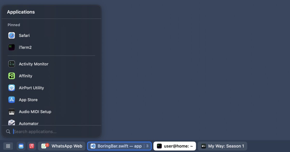
boringBar is not a full desktop environment replacement. It’s a lightweight, unobtrusive utility that sits at the bottom of your screen like a traditional taskbar. But its simplicity belies its power. Unlike the Dock, boringBar displays only the windows in your current Space. This means if you’re coding in Space 1 and watching a video in Space 2, you’ll only see the code editor in the taskbar—no distractions, no confusion.

One of its standout features is Space-aware window switching. Clicking on an app icon in boringBar brings that window to the front, just like the Dock. But it also respects your workspace boundaries. No more accidentally switching to a window in another Space and losing your train of thought.
Another key innovation is scroll-to-switch Spaces. Hover over the taskbar and scroll up or down to instantly move between virtual desktops. This is faster than using keyboard shortcuts or swiping with a trackpad, especially for users who prefer mouse navigation. It’s a small detail, but one that significantly improves workflow fluidity.
boringBar also includes a desktop switcher that lets you jump directly to any Space with a single click. This is particularly useful for users who manage multiple projects across different desktops. Instead of cycling through Spaces one by one, you can click a thumbnail and land exactly where you need to be.

Beyond the Taskbar: Pinning, Previews, and Performance
While the core functionality of boringBar revolves around window and Space management, it includes several quality-of-life enhancements that elevate the experience.
Pinned apps allow you to keep frequently used applications—like your terminal, browser, or code editor—always visible in the taskbar, even when they’re not running. This mimics the behavior of traditional taskbars and reduces the need to open the Dock or Launchpad.
Window thumbnails provide live previews when you hover over an app icon. This is especially helpful when you have multiple windows of the same application open—say, several terminal tabs or browser windows. Instead of guessing which one you need, you can visually identify it at a glance.

And for users who prefer keyboard navigation, boringBar includes a searchable app launcher. Type a few letters, and you can launch any installed application without touching the mouse. The creator admits he keeps Spotlight disabled due to its high system resource usage on his machine, making this feature a welcome alternative.
Reducing unnecessary mouse movements and keyboard shortcuts can lower the risk of repetitive strain injuries (RSI). Tools that streamline navigation, like boringBar’s scroll-to-switch and search launcher, contribute to a more ergonomic computing experience.
A Love Letter to GNOME 2 and the Spirit of Open Desktop Design
boringBar isn’t just a utility—it’s a statement. It speaks to a deeper desire among users for control, clarity, and customization. The creator openly admits that part of his motivation was nostalgia for GNOME 2, the desktop environment that launched his journey into Linux. GNOME 2’s panel-based design—featuring a taskbar, system tray, and application menu—was beloved for its flexibility and functionality.
When GNOME 3 arrived in 2011 with its radical “Activities Overview” redesign, many users revolted. The new interface prioritized aesthetics over utility, removing the taskbar and forcing users into a full-screen app launcher. This sparked a wave of forks and alternatives, including MATE, which continues to preserve the GNOME 2 experience.

The “GNOME 2 vs. GNOME 3” debate became one of the most heated in open-source history. Critics argued that the new design alienated long-time users, while supporters claimed it modernized the desktop for touch and mobile-first computing. The divide led to the creation of multiple desktop environments, proving that user preference in UI design is deeply personal.
boringBar channels that same spirit of user empowerment. It doesn’t try to replace macOS—it enhances it. It gives users the tools they need to work the way they want, without sacrificing the elegance and stability of Apple’s ecosystem.
Why This Matters in 2024 and Beyond
In an age of AI assistants, voice commands, and gesture-based interfaces, it might seem odd to champion a taskbar. But the truth is, most of us still spend our days in front of screens, managing windows, switching contexts, and juggling tasks. The tools we use shape how we think and work.
boringBar reminds us that simplicity isn’t about removing features—it’s about presenting the right information at the right time. It’s about reducing friction, not adding flair. And in a world where digital distractions are constant, that’s more valuable than ever.
The response from the Hacker News community—307 points and 178 comments—suggests that many others feel the same way. Users are sharing their own Dock frustrations, praising the app’s performance, and even contributing code to improve it. It’s a testament to the power of open-source collaboration and the enduring need for thoughtful, user-centered design.
As remote work continues to evolve and hybrid setups become the norm, tools like boringBar fill a critical gap. They bridge the gap between operating systems, between workflows, and between generations of desktop computing. They prove that sometimes, the most innovative ideas are the ones that bring us back to basics—with a modern twist.
In the end, boringBar isn’t just a dock replacement. It’s a return to clarity, a nod to the past, and a step toward a more intentional future of computing. And for anyone who’s ever missed the comfort of a simple taskbar, it might just feel like coming home.
This article was curated from Show HN: boringBar – a taskbar-style dock replacement for macOS via Hacker News (Top)